Making things work.
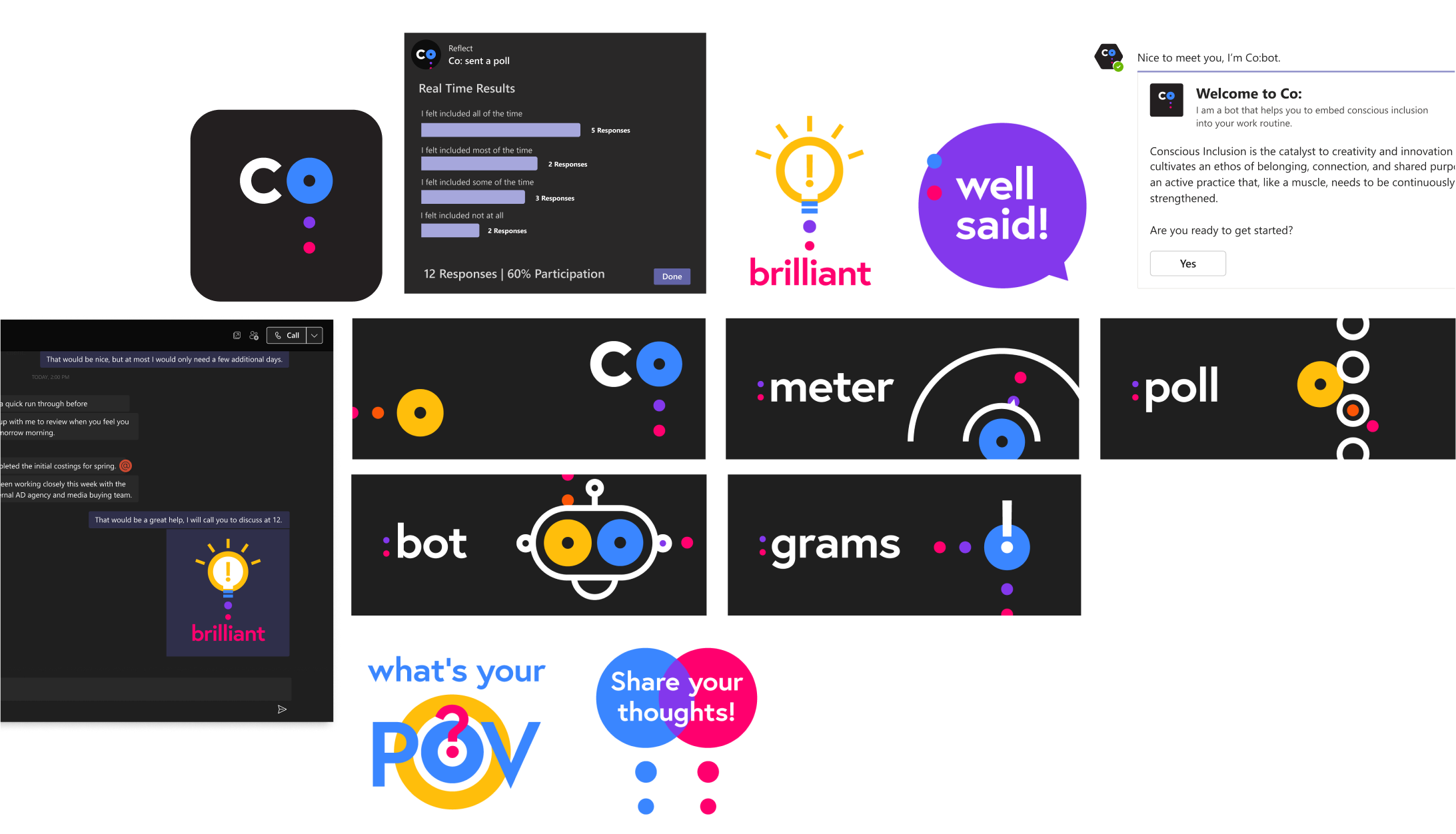
Co: an inclusivity app
Challenge
Name, brand, and graphic assets for an internal company set of collaboration software tools encouraged users to self-asses and improve their behaviors to be more inclusive.
Solution
A bite-sized name allowed the wordmark to look as good as an icon as a graphic. The dots can be positioned vertically to symbolize a thought bubble or horizontally to imply the bouncing texting dots we see when interacting on software. The brand was then extended to name features, and to a sticker package for people to easily communicate with.
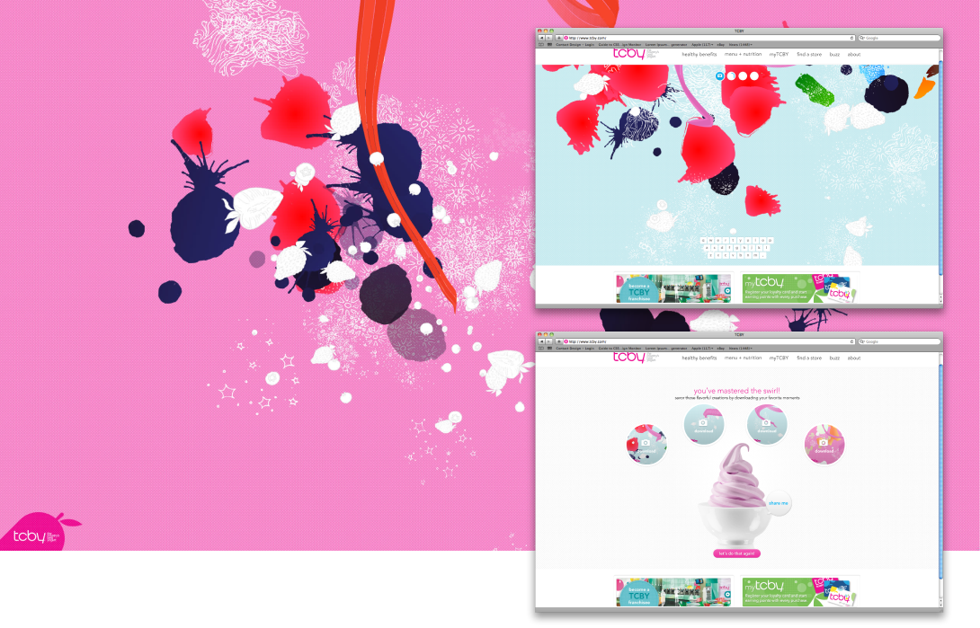
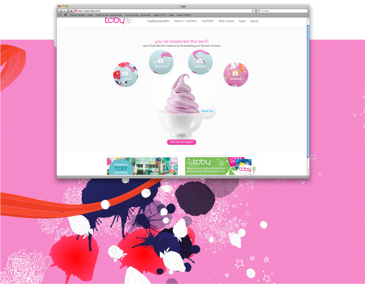
TCBY swirl experience
An unusual freelance project asked different artists to interpret TCBY’s topping flavors as abstract art to fuel an interactive fro-yo-inspired art-making swirl experience on their homepage. Users could download their outcomes and use as desktop backgrounds.
A tongue in cheek game about small business
Challenge
A platformer style video game centered around the tech challenges of running a small business.
Role Art director, designer, creative director
Solution
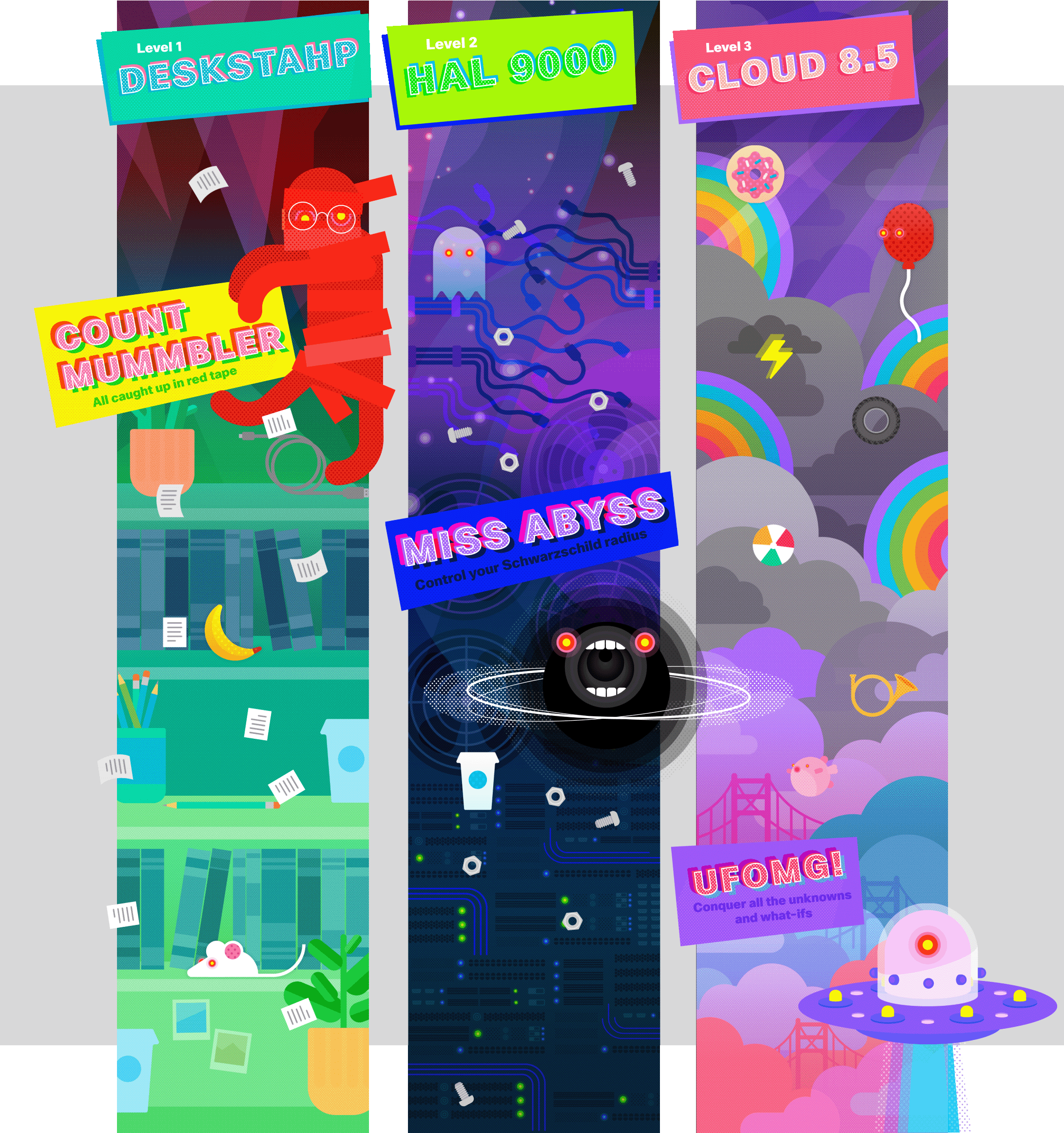
Teamed up with a writer to concept 3 themed levels (with bosses) to delight nerds everywhere.
Level 1 It’s your work world, complete with much-needed caffeine and mischievous mice.
Boss A bureaucratic mummy covered in red tape who spawning endless forms and documents down on your hero. While his papers do hurt you, his main attack to dodge is his tongue whip.
Level 2 Stacks on stacks. It’s amazing how much time those stacks can suck up.
Boss A dispassionate black hole that makes everything—including time—disappear. Don’t get too close. Don’t get too far away either. This black hole will suck server nuts and bolts right through you.
Level 3 It’s almost perfect. Beat the boss and get to cloud 9.
Boss An unidentified flying object that you didn’t know about, definitely didn’t expect, but still need to conquer. Watch out for the beams.
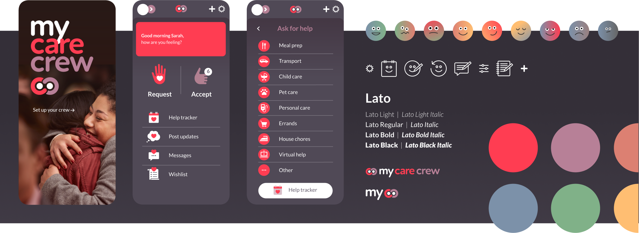
my carecrew app
Challenge
Brand an app created to assist cancer patients in creating a network that can easily support their care while minimizing the amount of coordinating it would take from the patient or family to leverage it.
Solution
Friendly rounded branding with soft colors, lower contrast, and dark backgrounds for tired eyes. The brand was then used to skin existing wireframes with custom task buttons, emotion tracker illustrations, and navigation icons to make the experience cohesive.