Building a design system that makes a corporate site read like a magazine.
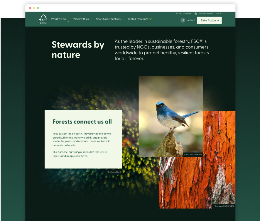
Client FSC is the leader in sustainable forestry—trusted by NGOs, businesses, and consumers worldwide to protect healthy, resilient forests for all, forever.
FSC’s site was functional but not inspiring. They were looking to update the site’s aesthetic without losing the existing architecture.
Challenge
Update existing site content and design with a limited scope and library of components.
Role: Creative director, lead designer
Solution
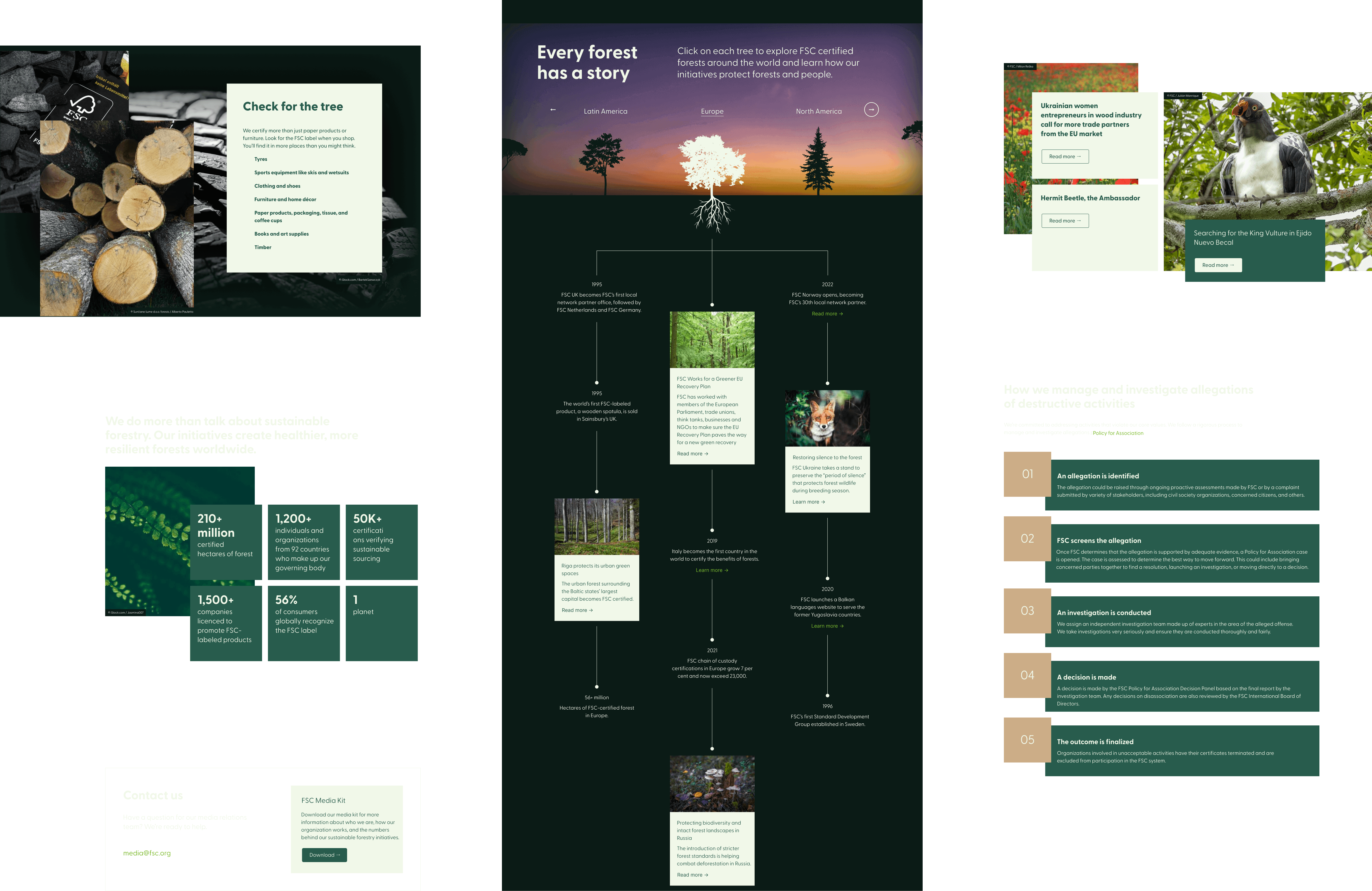
An audit of the site’s existing content was done to identify the core components that would get skinned or modified. New components were identified and created to add more consumer-centered design elements while trying to maximize flexibility of combinations for holding content of all different types.
2023 Webby Awards
People’s Voice Winner
Websites and Mobile Sites Sustainable Technology
2023 ANA B2 Awards
GOLD
Corporate or Brand Website
2023 The Drum Awards
Award
B2B: Website
Templates
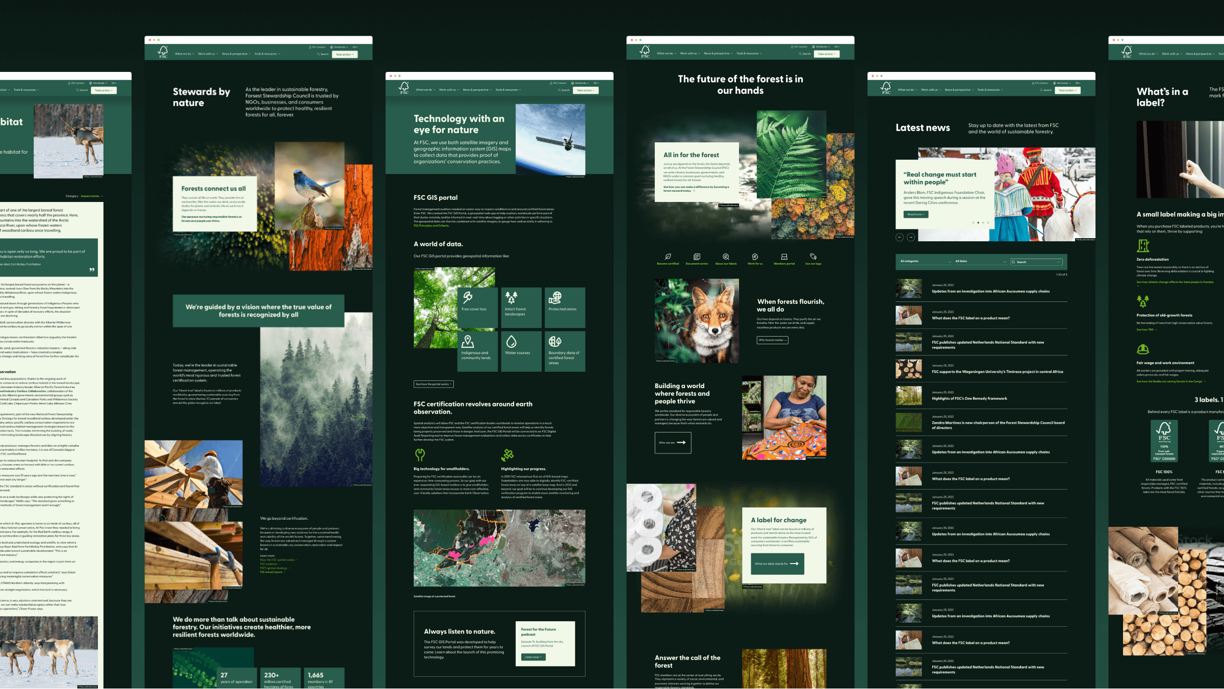
To test and illustrate the flexibility and range of content needed, we identified 10 ‘templates’ to represent specific site needs. Some were utilitarian like forms, posts, and feeds — others were created to showcase content in a way the old site’s components didn’t allow for. These pages proved the malleability of our small library of components could be arranged to achieve a range of content needs, and gave the client a foundation for creating similar patterns of content when new pages need to be authored internally.
Results
96%
decrease in bounce rate
15%
increase in session duration
36%
more returning visitors
61%
more page visits per session
Dark UI
One of the first design decisions made was to explore the feasibility of how low-carbon a site’s footprint could be. The darker UI not only saves energy, but gives the site more of a rich, organic feeling than the sterile, copy-heavy original site.
